This article is the final part in our series on the ember-data-table addon. In a first blog post we introduced ember-data-table, an easy-to-use component to visualize your Ember Data in a table including search, sort and pagination. The follow-up post explained how to customize the rendering of the data by defining custom table headers and column formatting. In this final article we will explain how you can add custom actions on top of the data table. We will continue on the books example of the previous post. A live demo is available on https://ember-data-table.semte.ch.
The addition of actions on top of the data table works similar to the customisation of the data table contents using contextual components. Assuming you’ve finished the previous tutorial, we will start from a data table component in block form containing a custom ‘content’ block:
{{#data-table content=model page=page sort=sort filter=filter as |t|}}
  {{#t.content}}
    <!-- our custom content here -->
  {{/t.content}}
{{/data-table}}
Add a ‘menu’ block next to the ‘content block’ inside the data table component. The menu block on its turn consists of two blocks: a ‘general’ and a ‘selected’ block. The ‘general’ block is shown by default. The ‘selected’ block is shown when one or more rows in the data table are selected. It typically contains actions that will be executed only on the selected items.
{{#data-table content=model page=page sort=sort filter=filter as |t|}}
  {{#t.menu as |menu|}}
    {{#menu.general}}
      <!-- general menu items here -->
    {{/menu.general}}
    {{#menu.selected as |selection datatable|}}
      <!-- selected menu items here -->
    {{/menu.selected}}
  {{/t.menu}}
  {{#t.content}}
    <!-- our custom content here -->
  {{/t.content}}
{{/data-table}}
Next, add the menu items as anchor elements to the ‘general’ and ‘selected’ blocks. Each anchor element contains an Ember action helper that will execute the appropriate action. The actions in the ‘selected’ menu block receive the selected rows and the data table as parameters.
{{#data-table content=model page=page sort=sort filter=filter as |t|}}
  {{#t.menu as |menu|}}
    {{#menu.general}}
      <a {{action 'export'}}>Export</a>
      <a {{action 'print'}}>Print</a>
    {{/menu.general}}
    {{#menu.selected as |selection datatable|}}
      <a {{action 'delete' selection datatable}}>Delete</a>
    {{/menu.selected}}
  {{/t.menu}}
  {{#t.content}}
    <!-- our custom content here -->
  {{/t.content}}
{{/data-table}}
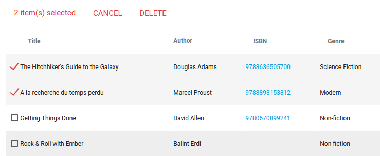
If you would render the data table now, you will see the ‘general’ menu on top of the data table. As soon as you start selecting rows, the ‘selected’ menu will be shown. This menu automatically contains a ‘Cancel’ button to clear the selection without executing an action.
Finally, we need to implement the menu actions in the controller. In the example above we defined three actions: ‘export’ and ‘print’ in the general menu and ‘delete’ in the selected menu. Since the ‘delete’ action receives the selected rows and the data table as parameters, the action method signatures in the controller will look as follows:
actions: {
  export() {
    // implement export action here
  },
  print() {
    // implement print action here
  },
  delete(selection, datatable) {
     // implement delete action here
     // e.g. selection.forEach(function(item) { item.destroyRecord(); });

     // clear the selection at the end
    datatable.clearSelection();
  }
}
You can now implement the actions in any way you want. Just note that in the actions of the ‘selected’ menu you need to clear the selection by yourself in the end by calling datatable.clearSelection() as shown in the example above.
This post concludes our series on the ember-data-table addon. We hope you’re convinced on the easy-of-use of this addon by following the tutorials. Feel free to make a contribution or log an issue if you have a problem using the ember-data-table.