This article is a follow-up on how to visualize your Ember Data with the ember-data-table. Have a look at the first tutorial if you want to get started with the ember-data-table addon. This article explains how to customize the data table by defining custom table headers and column formatting. We will continue on the books example of the previous post. A live demo is available on https://ember-data-table.semte.ch.
In the previous tutorial we created a simple data table to list the books in our library. We used the default header and column rendering resulting in table headers like ‘publicationDate’ and ‘nbOfPages’ and non-formatted data in the columns such as ‘Wed Jan 01 1913 01:00:00 GMT+0100 (CET)’. In this tutorial we will first customize the column header. Next, we will format the data and enrich it by showing the author(s) of the books.
Customizing the table headers
To customize the data table we will update the template containing the data table component. First, remove the fields parameter. Next, convert the component to the block form so that we can provide custom HTML content.
{{#data-table content=model page=page sort=sort filter=filter}}
    <!-- our custom content here -->
{{/data-table}}
We can now define our custom headers using contextual components wrapping inner components within the context of outer components. Add the table context as variable ‘t’ and define a ‘content’ block component. Next to the content block, the data table can also have a menu block containing custom action buttons. We will elaborate on this in a next blog post.
{{#data-table content=model page=page sort=sort filter=filter as |t|}}
  {{#t.content}}
    <!-- our custom content here -->
  {{/t.content}}
{{/data-table}}
The content component wraps two components itself: a header component and a body component. The names are self-explanatory. The header component contains the column headers. The body component contains the actual data – the body – of the data table.
Let’s start with the header. Add the content as a context variable on the content component and wrap the header component in it.
{{#data-table content=model page=page sort=sort filter=filter as |t|}}
  {{#t.content as |c|}}
    {{#c.header}}
        <!-- our custom headers here -->
    {{/c.header}}
  {{/t.content}}
{{/data-table}}
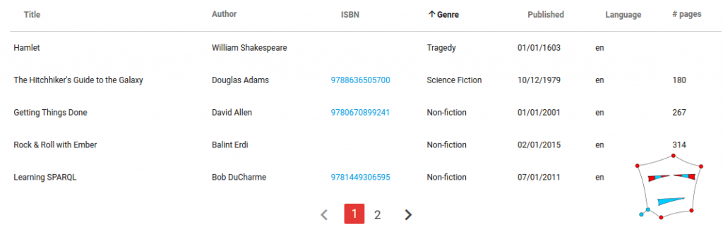
Define your custom HTML content to display the table headers in the data table. In its simplest form the headers could just be <th> table headers containing a custom label:
{{#c.header}}
    <th>Title</th>
    <th>Author</th>
    <th>ISBN</th>
    <th>Genre</th>
    <th>Published</th>
    <th>Language</th>
    <th># pages</th>
{{/c.header}}
If you want the column to be sortable, you can use the th-sortable component provided by the addon. This component will automatically display the table header with the appropriate sort icons depending on the current sorting. Just pass the field (model attribute), label and current sorting to the component.
{{th-sortable field='title' currentSorting=sort label='Title'}}
The header may consist of a mix of sortable and non-sortable table headers, for example resulting in:
{{#data-table content=model page=page sort=sort filter=filter as |t|}}
  {{#t.content as |c|}}
    {{#c.header}}
        {{th-sortable field='title' currentSorting=sort label='Title'}}
        <th>Author</th>
        {{th-sortable field='isbn' currentSorting=sort label='ISBN'}}
        {{th-sortable field='genre' currentSorting=sort label='Genre'}}
        {{th-sortable field='publicationDate' currentSorting=sort label='Published'}}
        {{th-sortable field='language' currentSorting=sort label='Language'}}
        <th># pages</th>
    {{/c.header}}
  {{/t.content}}
{{/data-table}}
Formatting the table columns
Similar to the header component, we can include a body component in the table’s content block. The row context is passed as a variable ‘row’.
{{#data-table content=model page=page sort=sort filter=filter as |t|}}
  {{#t.content as |c|}}
    {{#c.header}}
        ...
    {{/c.header}}
    {{#c.body as |row|}}
        <!-- our custom body here -->
    {{/c.body}}
  {{/t.content}}
{{/data-table}}
The ‘row’ variable contains the Ember Data record to be displayed. Displaying an attribute or relationship works as you would expect:
{{row.title}}
{{row.authors}}
The custom HTML content defined in the body component are wrapped in a <tr> tag. We just need to define the <td> tags, one per column. The content of the <td> tags may include any valid HTML, including other components like for example ‘moment-format‘ to format a date or the join composable helper to display an array of values.
{{#c.body as |row|}}
  <td>{{row.title}}</td>
  <td>{{join ", " (map-by "name" row.authors)}}</td>
  <td><a href="https://www.google.be/#q=isbn:+{{row.isbn}}&*">{{row.isbn}}</a></td>
  <td>{{row.genre}}</td>
  <td>{{moment-format row.publicationDate 'MM/DD/YYYY'}}</td>
  <td>{{row.language}}</td>
  <td>{{row.numberOfPages}}</td>
{{/c.body}}
This concludes the tutorial how to tailor the ember-data-table to your app. Have look at the addon’s README to get an extensive overview of all the options, components and helpers of the data table. In a next blog post we will explain how you can add a menu containing custom action buttons to the data table.